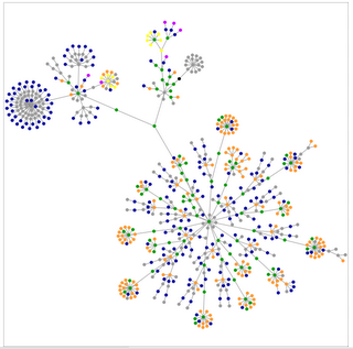
Here's a graph of Gordon's Notes. I don't know how to interpret it, but I do wonder about that tight dnese cluster in the top left.

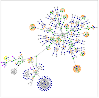
By comparison, here's Gordon's Tech. Very similar though rotated. I did it twice to see if I'd missed something. I'd guess the big cluster is OS X related ...

By comparison, my old web site has very few pages (though they're much longer than blog postings):

Ok, so that wasn't all that useful ...